Layout and design issues with Windows BluOS Controller
AnsweredI'm using the BluOS Controller on Android, iOS and Windows. All have their design issues and I wonder how these could pass quality control.
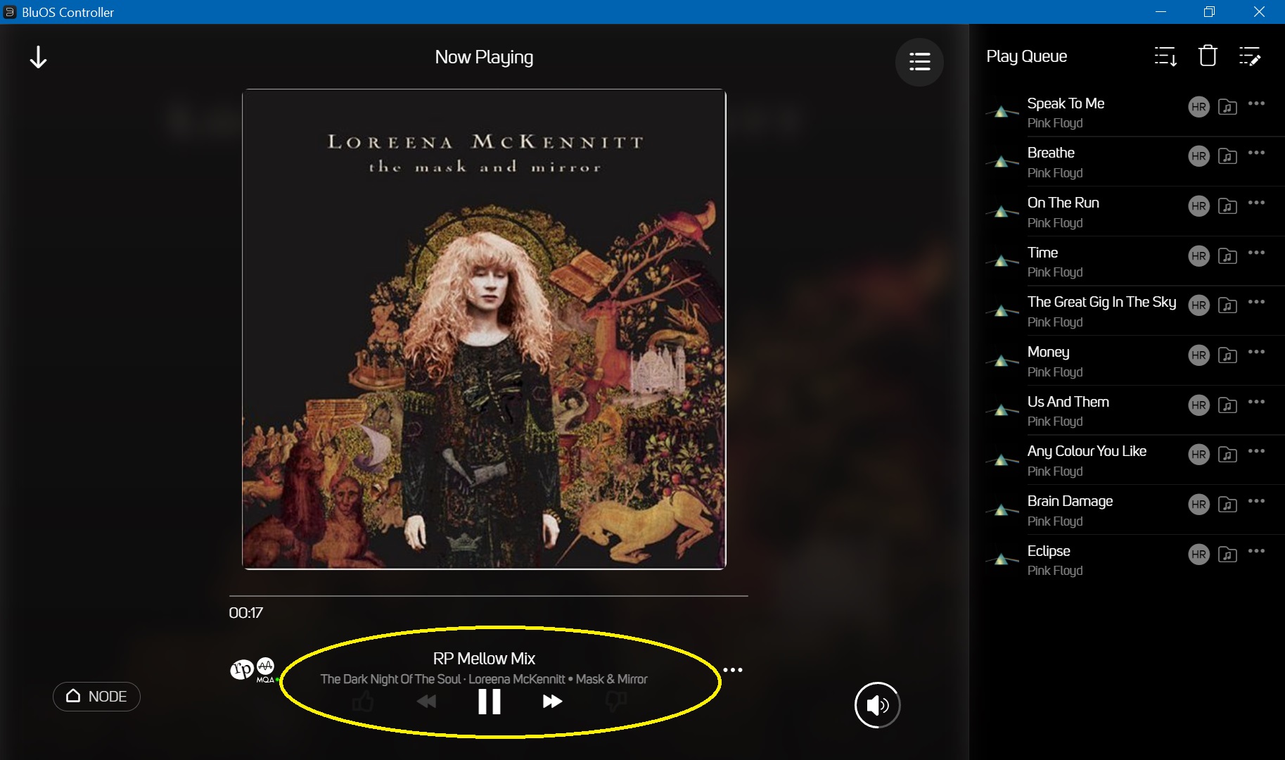
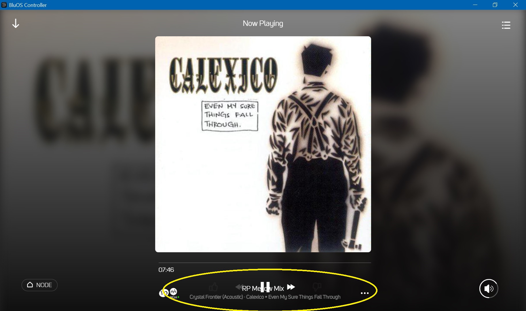
Here are screenshots that examplify the issues in Windows, made in fullscreen mode on a Full-HD notebook:
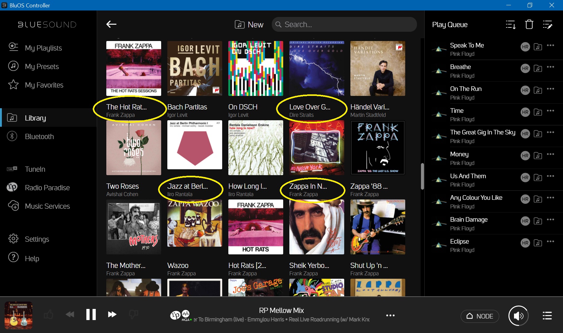
In the album list, it would come very handy, if one could click on the artist name to jump the artist page.
I'm coming from Auralic Lightning DS (which is far from being perfect), where these issues are handled in a much better way.
What does the community think?
-
Official comment
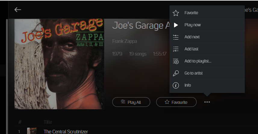
Thanks for the feedback - That being said... click on the Album and when viewing the album, click on the more indicator in the Album Header and Go To Artist
-
Hello Jörg,
the layout bug was reported more than 5 months ago
Windows Controller app not scaling correctly – The Bluesound Support Crew
And still not fixed!
Regards,
Hubertus
0 -
Thanks for the quick reply, Tony.
click on the Album and when viewing the album, click on the more indicator in the Album Header and Go To Artist
It would just be nice, if it could be managed with a single click, which would seem pretty obvious (and easy to code) to me. Why would the artist name not be a link to his page?
Another thing missing in the album list is the release year, which is very important if you have lots of albums of an artist. You see, I'm a Zappa fan...
0 -
What would you think of this?
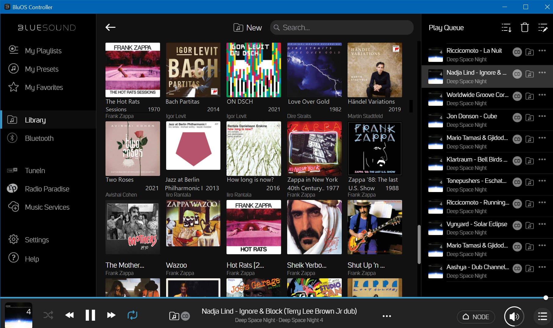 0
0 -
The application interface is awful for folks who have large collections. You can't hide the left or right panel, get an album "list view," or even see the full name of an album or a track. The main point of the thing is to display information from a database and then let a user click an action button. That is tech that is 25 years old but it seems that BluOS isn't trying to figure it out.
1
Please sign in to leave a comment.

Comments
5 comments