BlueOS Desktop App: Layout of Play Screen
Answered
Hi
I use BlueSound and the Windows Desktop App since 2019. I am a bit annoyed that the play screen has never been adapted to show the name of the current track without text scrolling and the list of tacks on the right panel with adjustable width, so that you can actually read, what is played.
The screen layout has almost no responsive design to screen size and resolution. This should be normal by today's standards.
Please, don't add only features to your hardware but also improve the usabilty of your apps.
The screenshot shows, what I mean:
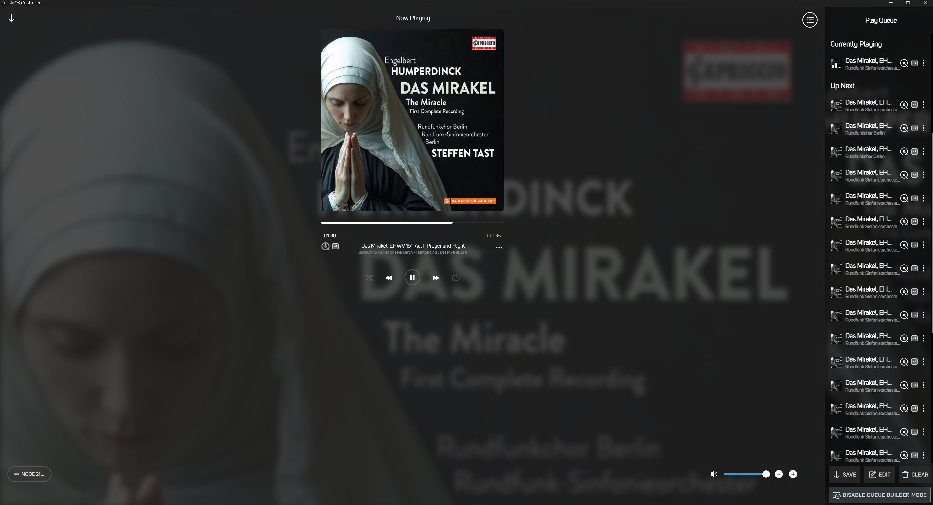
The text displaying the current track is too smal to be readable. The text is scrolled, althouhg there would be plantymof space on the Windows desktp, when you use the app in full screen mode. Also, the width of the side panel, which shows the current track list, cannot be adjusted, so that you can read the titles of the tracks completely.
-
Official comment

Hi,
I have forwarded your feedback to our quality assurance team for future update consideration.
Please sign in to leave a comment.
Comments
1 comment