no more "go to artist" or "go to album"?
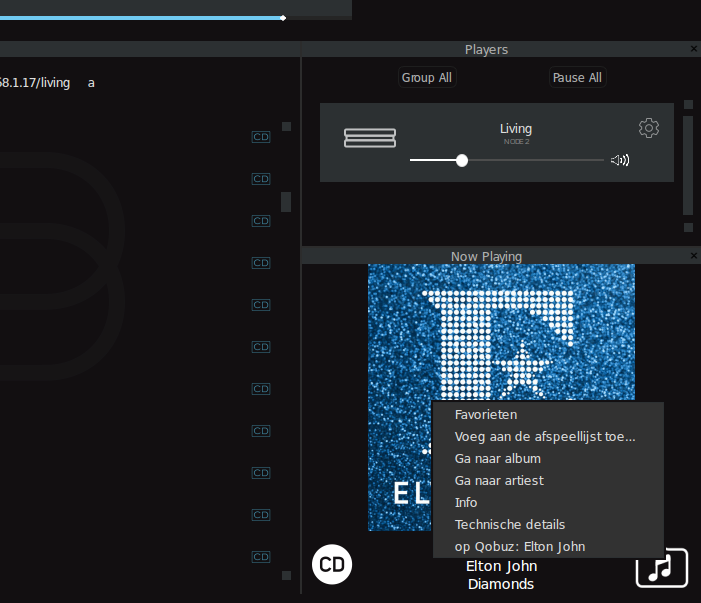
On the good old windows app (2.14.0) when you do a right click on the "now playing" field with the album art display you get a drop down menu offering, amongst other choices, to go the artist or album in the library.(see pic)
In the latest winapp this function is no longer there. Yet another interesting item that has been sacrificed on the altar of "progress"?
It would be nice to get that back the way it was in the beginning, when I purchased my Bluesound gear.

-
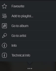
Tried the more (3 dots) menu?
0 -
 0
0 -
Yes, I see. But in my defence, it doen't work any longer as it used to do. (see pic) You have to enlarge the "now playing" in order to even find the dots. Compared to my preferred version of the app it demands yet another extra manipulation to get to the wanted result. UI efficiency has been degraded with every iteration of the app.
It's like ,if you bring your car to the workshop for maintenance you get it back as a three wheeler because some overzealous marketing guy decided this is the new and better way to go.
I would like to at least have the option to get my system back to the point where I bought it and was satisfied with it. I don't like three wheel cars and prefer intelligence over beauty.
 2
2 -
I would like to at least have the option to get my system back to the point where I bought it and was satisfied with it. I don't like three wheel cars and prefer intelligence over beauty.
I fully agree with you on that!
From having an app/controller that was more than ok, we now have a player that is not. I have sold most of my equipment, my kids stopped using it, and I, for the most, is back to the 90's using a windows player/library to play music.
Not how it should be!1
Please sign in to leave a comment.

Comments
4 comments