Inconsistent layout of Bluos app (version 4)

I am not happy with the current Bluos 4 user interface, it is very messy, in my opinion...
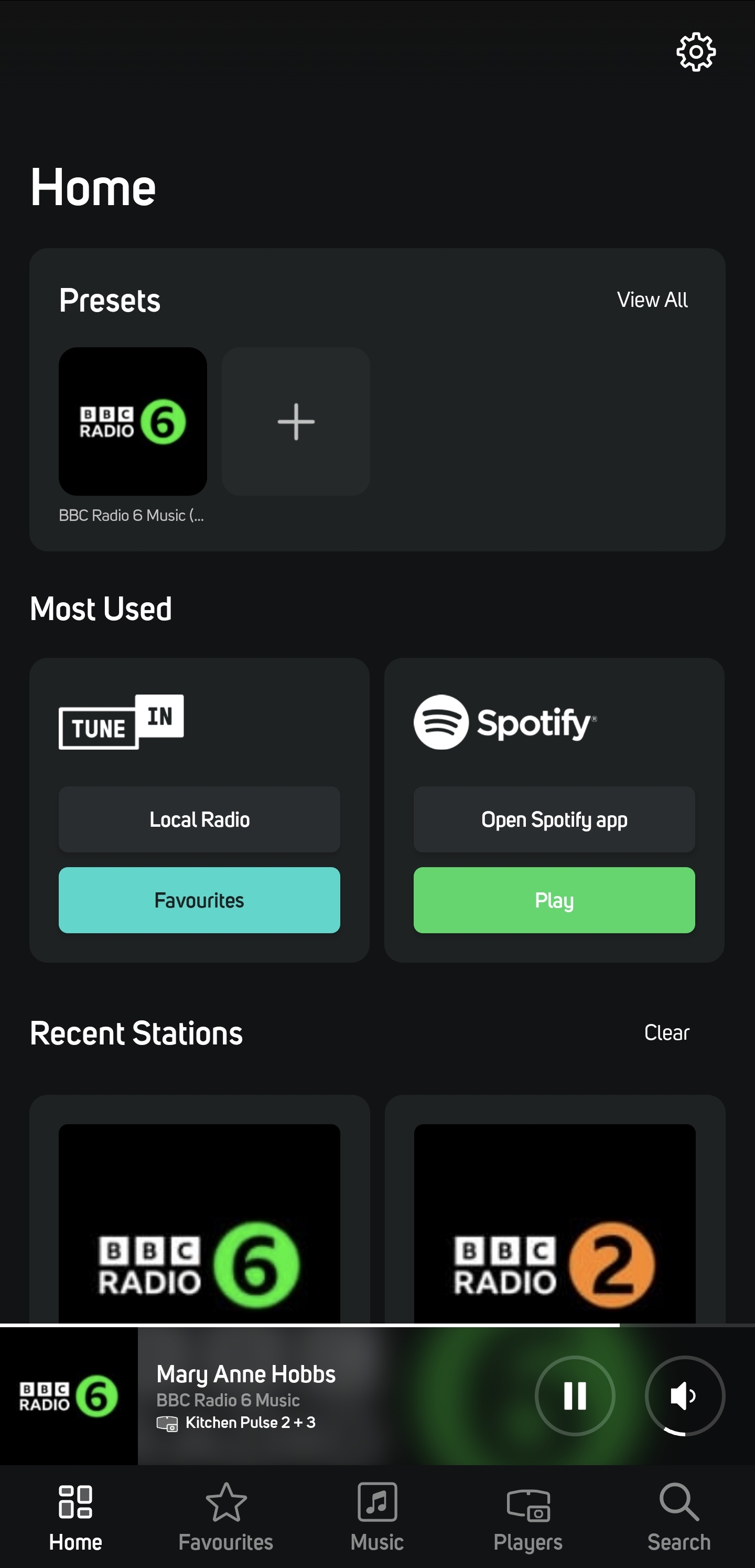
The tiles all have a different look, when you switch from Home to Favorites, Music etc. Why is this? I would have preferred a smooth tile look in the complete app.
An example in the Home screen:
The presets are in one big gray square, with smaller icons for all your presets. Recent Stations are seperate gray tiles, all with its own icon, much bigger.Most Used has tiles with seperate buttons in it, but the reaction is sometimes different in comparison to opening it directly, e.g. Qobuz shows New Albums in a list when selecting it via Most Used, while it shows a far better interface when you open it via Music (Tiles view).
Can you improve this User interface to be consistent in the complete app?
-

The v4 UI is horrendous: inconsistent and inefficient.
My S24 Ultra has 7 vertical icons on the home screen. All useable with zero issues.
In Bluos Android app 4.2.4 I get 3.5 UI elements vertically on the home screen (including the current playing bar at the bottom):
7 on favourites, 6 on Music and 5/6 in players depending on player groups etc.
Every tab has different icon size and/or spacing. It's the most inefficient use of screen real estate of any app I use. Looks clunky and old fashioned and toytown or as if it was designed for people with accessibility issues or children. I've no issue with designing for accessibility but should be an option in the UI or tied to accessibility options in OS.
4 -

+1.
1 -

What Chris Tyas says is bang-on: it's a waste of space with 3.5 usable elements.
Spotify shows 9, because they simply don't waste space.
1 -
Hope for a reaction from the support team and start actions to improve.
1 -
Thanks for starting with a more consistent interface... Not all is correct, but I appreciate the start of it!
1 -

Thanks Frank
Over 250 pages in 3 different platforms. We knew we weren't going to get to all of them off the bat so you are now seeing phase ii of that progress. Agreed still some work to do but we will get there.
0
Please sign in to leave a comment.
Comments
6 comments