Control contrast
Answered
-
Official comment

Hi William
In BluOS, on is blue, off is grey.
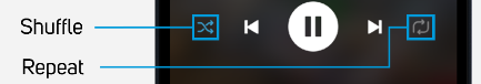
In this graphic, Shuffle is ON (Blue) yet Repeat is off (Grey) -
I understand the difference. What I am saying is that the difference is too subtle and too hard to see. To me, it’s about the difference between beige and tan. Even in your screenshot, the variation between On and Off is overwhelmed by the bright blue lines you used to point with.
0 -
Look at the Apple Music app: the Shuffle and Repeat symbols turn into white buttons with contrasting symbols when pressed. Or FooBar 2000, where the (much larger) symbols turn to bright green when pressed. This is good UI.
2 -
I'll also note that your own Mac app uses a highly-visible contrast between dim and bright for these controls.
0
Please sign in to leave a comment.
Comments
4 comments