BluOS 4.x: Tile Design optional for Presets
Answered-
Official comment
Hi Art
From the Home Screen on the Presets Tile - the top right should say View All.
-
From the Home Screen on the Presets Tile - the top right should say View All.
Hi Tony
Ok, "Show all" was my guess since I'm using the German version.
Nevetheless the next screen is not in tile design but comes as a list.1 -
Presets Tile View ! -- I agree, I would like the option to keep the TILE VIEW from the PRESETS - View All
1 -
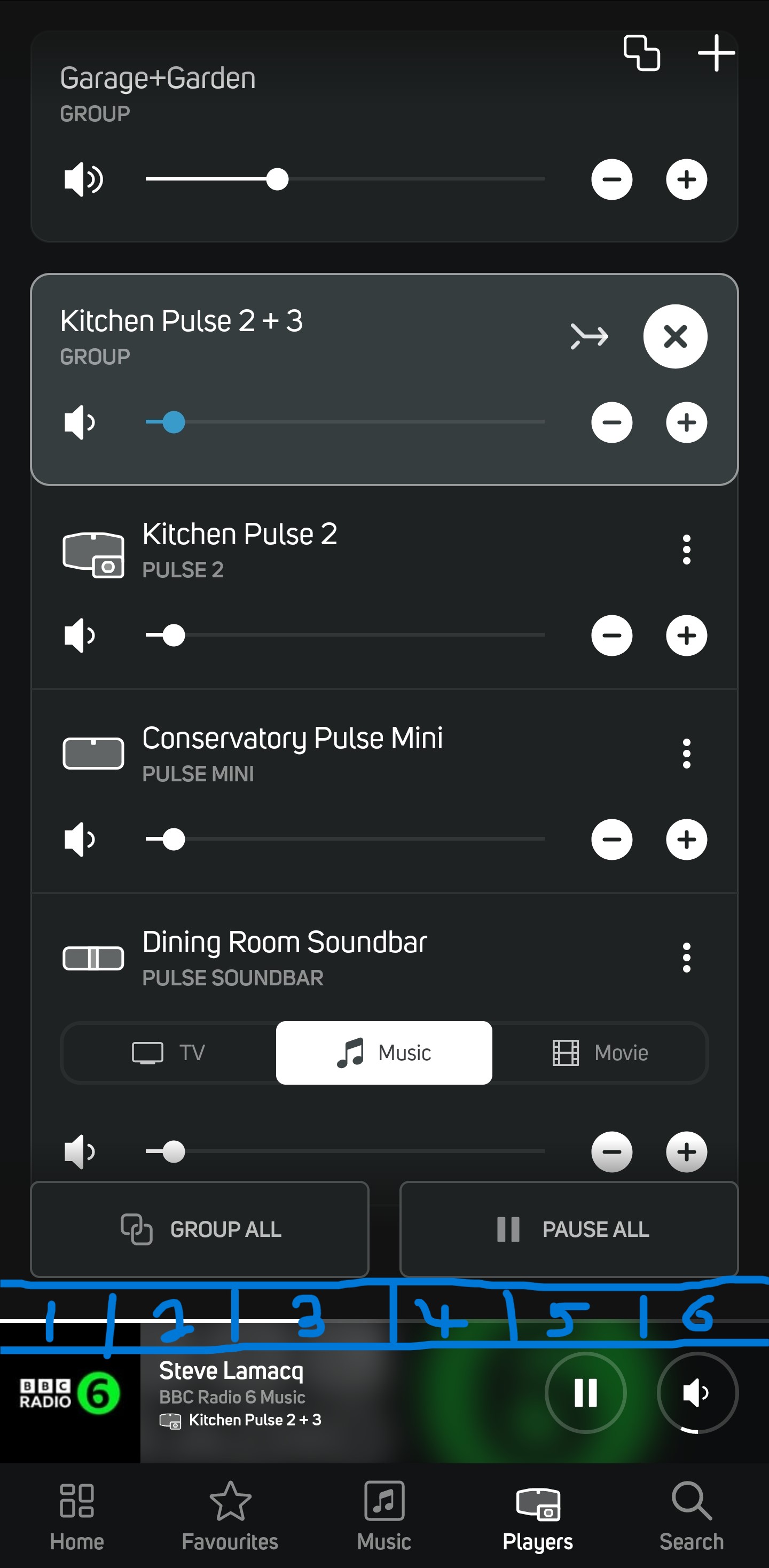
Presets for selected player should be horizontally arranged buttons permanentlydirectly above (integrated into) the selected player bar at the bottom of the app. The selected player bar could be 2/3 it's current height on my phone (S22 Ultra), I understand devices with lower resolution / smaller screens may have different requirements.
I don't think anyone involved in Bluos software design or testing understands the concept of presets, they need to speak to the Bluesound hardware people who put preset buttons on top of the flex where they should be; the whole point of presets is to have a quick, easy, 'shortcut' to commonly used streams etc for a particular player or group. Having them on the Home tab is, quite frankly, ridiculous and counter-intuitive.
Apart from presets being weirdly located there I appear to have no use for the Home tab as not being to access it for 36 hours now I can't even remember what else is on it.
 0
0
Please sign in to leave a comment.

Comments
4 comments