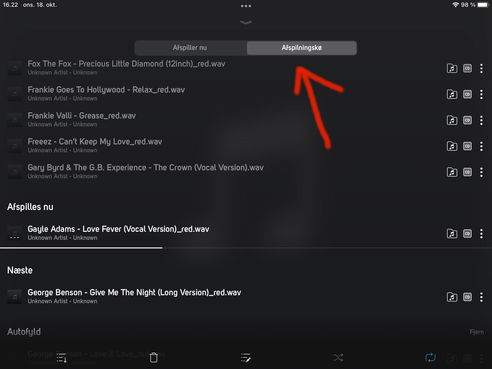
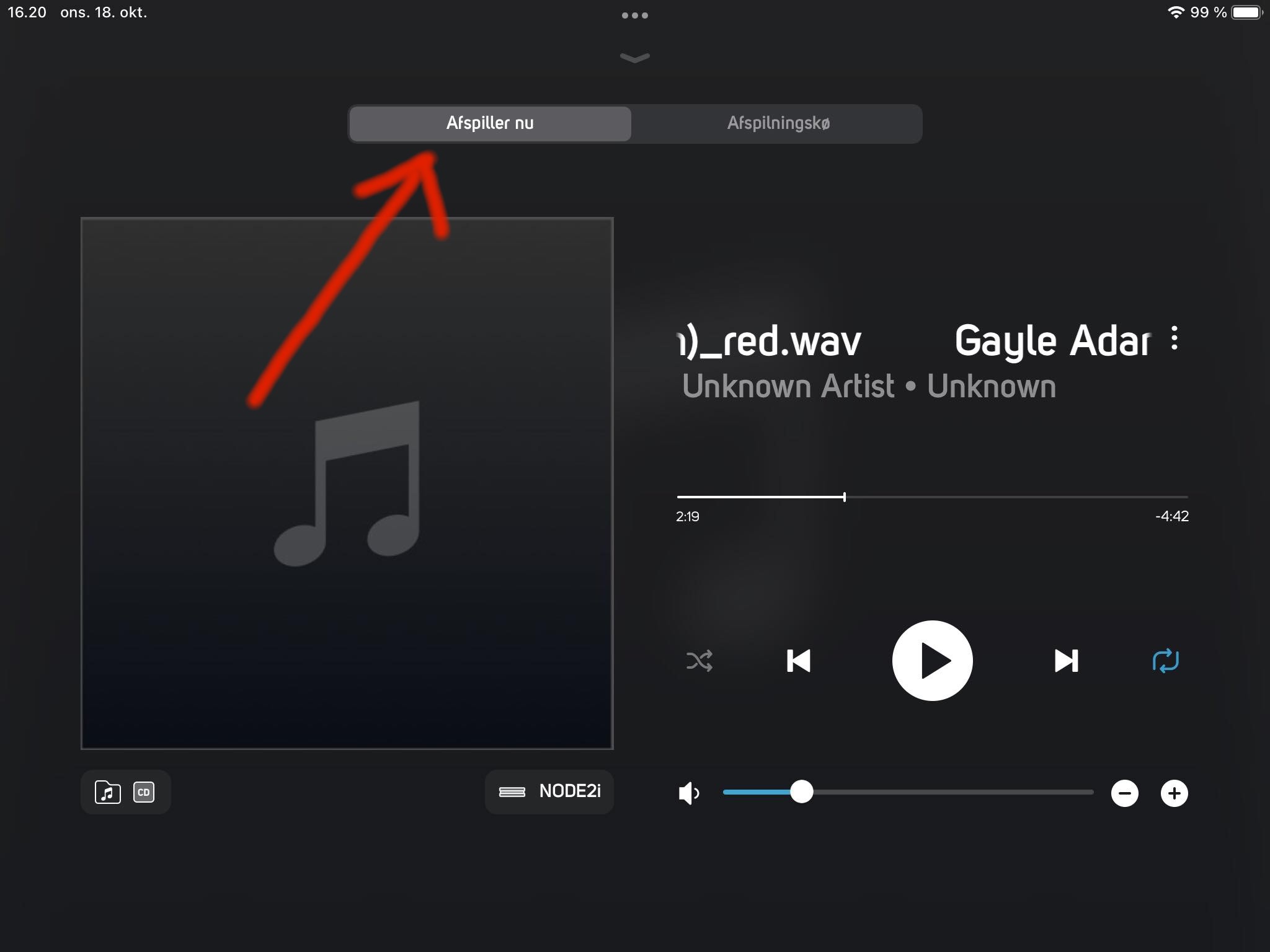
The UI in BluOS 4.0 needs a redesign in the 'play section'
AnsweredI don't like BluOS 4, there is an option to have the UI from BluOS 3, but the problem I have is that in either one the UI for playing my wav/flac files, has two tabs. One for 'playing now' and one for 'playlist', this is very annoying in my use case (and before in the old OS they shared the page) This has to be redesigned, it cannot be that I can't fastforward on the 'playlist tab', every single time I have to change to 'playing now' to be able to fastforward. Then again I have to change tab to go to 'playlist' to find the next song I want to play. I am so unhappy about this change, that I don't even want to play music at all.
-
Official comment
Hi John
Sorry to hear this...
I have passed it along to our Quality Assurance Team.
-
Thank you sir, much appreciated.
1 -
Hi again, I have just installed the new update, but sad to see that nothing has changed in regard to the 'file player' it still has the two tabs, one for 'playing' and one for 'file list'.
This has to be changed to how it was on BluOS 3, where you could fastforward and change song on the same page/window.
Please fix this, thank you.
 0
0
Please sign in to leave a comment.


Comments
3 comments