Ghastly
AnsweredI have a NAD M33 and try to use Tidal through the BluOS app on my iPhone or iPad. The UI is ghastly. I don't know who conceived of a controller that does not even show the track currently being played. I don't know if it's Tidal or BluOS, but in any case it's a horrible user experience.
And how music can be downloaded so that I'm not constantly streaming the same thing when it could be stored locally in either the app or the M33 is totally opaque.
I suggest tossing this thing out and starting over again from scratch with a new UI design.
-
Official comment
@Russ Not sure I understand your problem clearly but please allow me to point out something.
Scrubbing - the problem you describe - many music streaming apps on the phone (android) behave the same as BluOS. To scrubb, you have to click the bottom to open "Now Playing" otherwise you cannot. However, all their Windows apps don't seems to have this issue.
The second problem on Tidal content not geared toward user content - I don't follow this one, perhaps I don't understand the issue. On BluOS you open Tidal and go to "My Music" and all your library is there, playlists, Artists, Albums, you can also have favourite albums on the main screen.
Last, does the NAD have Tidal Connect? perhaps you could use that feature instead of the BluOS app.
Did I miss the issue you were explaining?
-
The problem is not with the NAD M33, it's with the BluOS app for the iPad/iPhone.
0 -
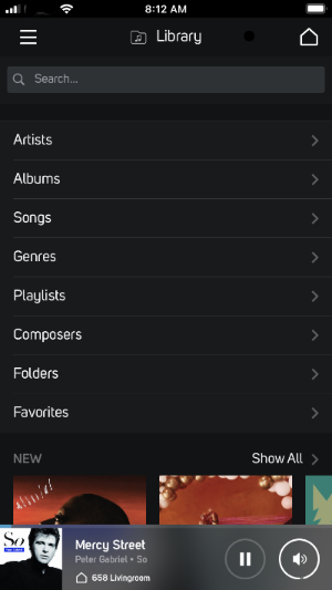
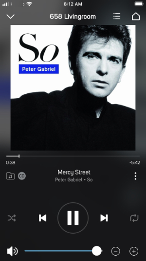
Here are screenshots of BluOS app from my iPhone, the first shows the track at the bottom of the screen. Tapping that will bring up the larger now playing screen.
 0
0 -
You're in the right place for comments and questions about the app, UI and usability in general. I'm a user like you and have no affiliation with the company. Also an M33 owner.
The BluOS app continues to evolve and a completely redesigned version is due later this year.
0 -
Seppi, no negativity from me. I'm only trying to assist Russ one user to another.
0 -
When I look for support for the BluOS app from the BluOS website, it sends me here. I'm not sure where the line is drawn between BluOS and Bluesound and who's making money from what, but this is the forum to which BluOS directs traffic.
As I see it, there are three fingers in this mess. The BluOS app, the source content provider, and the hardware. For the last two years I've had a dedicated Mac Mini connected to the USB port on the NAD M33 streaming content from the Apple Music app. The content is controlled by the Apple Music app, the volume is controlled by the BluOS (source = computer) because the music stream is not bit clipped to provide volume control and the BluOS app is controlling the gain on the M33, and either the BluOS app or the Mac can initiate play/pause. That's a pretty ugly UX, but apparently the only way to get hi-res content from Apple Music to an amp.
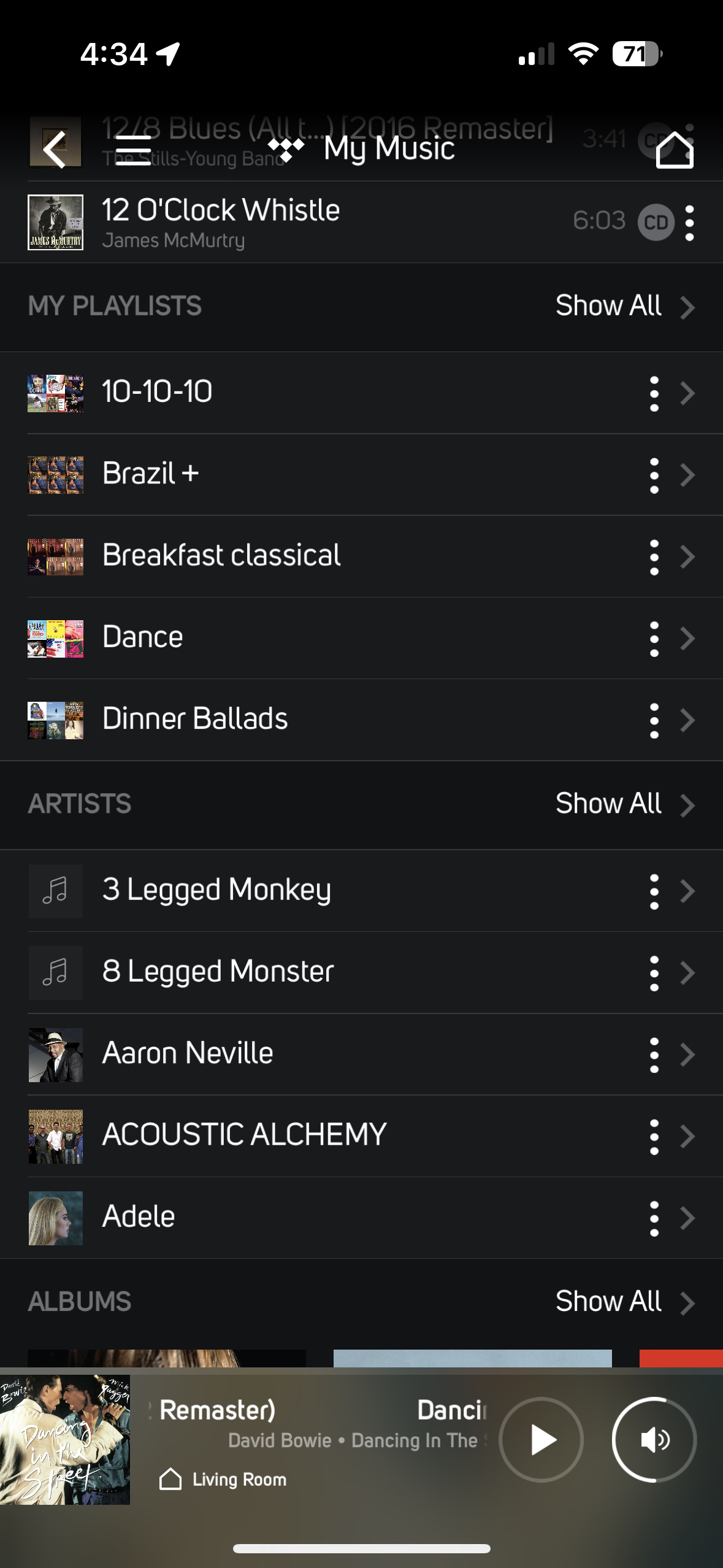
Now I'm giving Tidal a try, so the Tidal UI appears in the middle of the BluOS app but has to exist within the BluOS app UI/framework/navigation. The Tidal UI is very oriented to Tidal content and Tidal curation. It is very light on the concept of the user having their own "library" of Tidal content. So you get screens like this in the BluOS app. A mashup of some Tidal UI, the BluOS strip at the bottom which even when playing does not provide scrubbing, etc. Yes, I realize you can tap on the BluOS mini-player and then get a full screen with scrubbing, volume, next/previous, etc.
And I should add that the Tidal UI through BluOS is also very very slow.
My comment, if whomever is responsible for the BluOS app reads this stuff or cares, is that this is a very poor UX. It takes a significant investment of time to understand which pieces of the display I'm seeing are BluOS trying to juggle multiple sources and devices, versus the source providers UI by which I control what is actually being played. When I talk to my AV supplier, I tell them it's a poor UX and that he shouldn't be using me as a reference. If this is what BlueSound, which appears to be a hardware company, is promoting as the UI for its headless equipment with no controls, I won't be recommending that either.
It is a difficult problem to integrate multiple sources and playback devices into a comprehensive yet simple UI/UX. Somebody is going to do a better job of this someday.
I ran a large product marketing organization for a few years. I valued customer feedback. I appreciate other users trying to help me, but I'm not looking for help with this post. I'm trying to provide feedback to whomever is responsible for what I consider to be a poor UX.
 0
0 -
Regarding the official comment:
- Thank you for the comments on scrubbing. I interpret that answer as "everyone else is doing it this way...".
- The issues with Tidal's library curation and presentation UX are with Tidal and don't need to be aired here. As far as I can tell NAD does not have Tidal Connect, but others probably know more about that.
- The big picture is that the total experience of mixing the UI/UX of BluOS, a source (e.g., Tidal, computer, etc.), is not working for me. I appreciate that that is what BluOS is trying to do and that without a big hammer to force UI standards the UI ends up being a mashup. But I don't see how that is benefiting any of the participants.
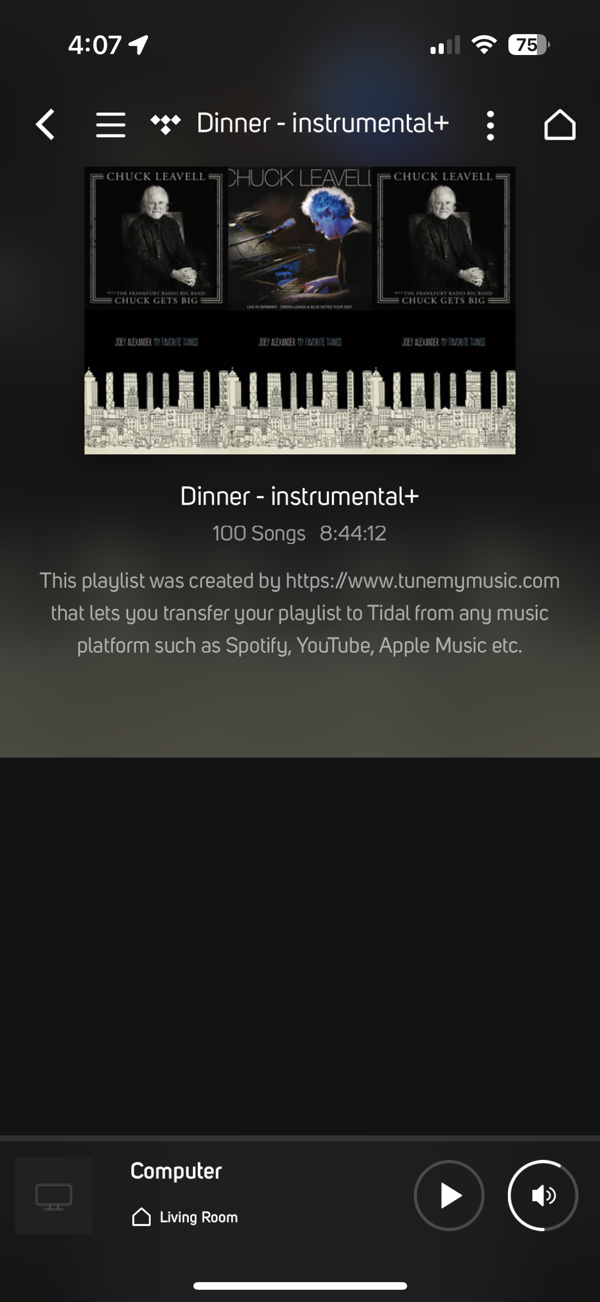
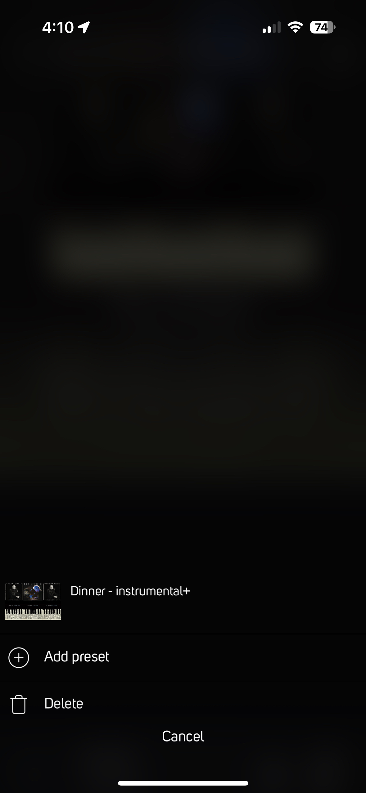
Here's an example. The top half of the first screenshot is a playlist from Tidal, but there are no details and no ability to play the list. The bottom strip says the player thinks it's playing from the computer. If I were to push play, what would play? Clicking on the vertical ... produces a mostly blank screen with the name of the playlist and two buttons, one to add a preset, the other to delete. Is this screen from Tidal? BluOS? What is is for?
Is the player queue unique to the M33, or is that a "feature" of BluOS?
An entirely separate question that was raised at the top of the thread is the distinction between BluOS and Bluesound. Are these different entities? How are they related? I assume Bluesound makes money selling hardware. What revenue stream is funding BluOS?
Thanks.
 0
0 -
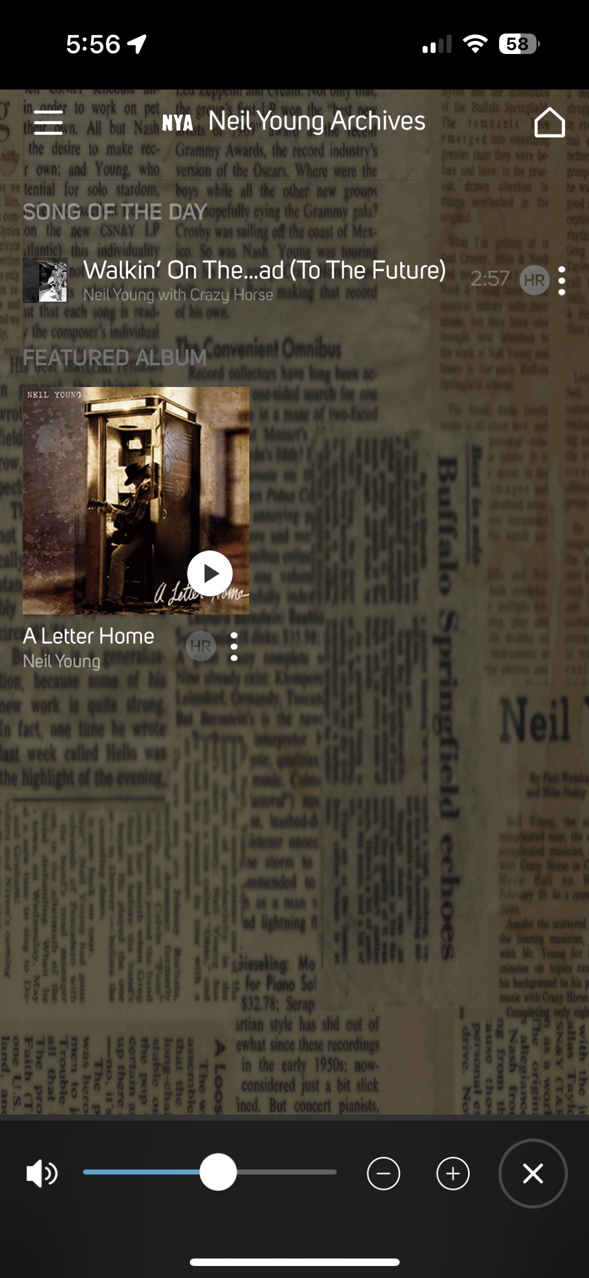
Here is another example. I'm playing from the computer, yet the display is showing me something from Tidal. I realize that the controller does not know what is being played from the computer, but displaying something from Tidal make no sense and is misleading.
 0
0 -
Isn't this a screen grab from a cell phone, not BluOS controller on the computer?
In stating 'playing from the computer' do you mean a file stored on the computer or using BluOS controller on the computer?
0 -
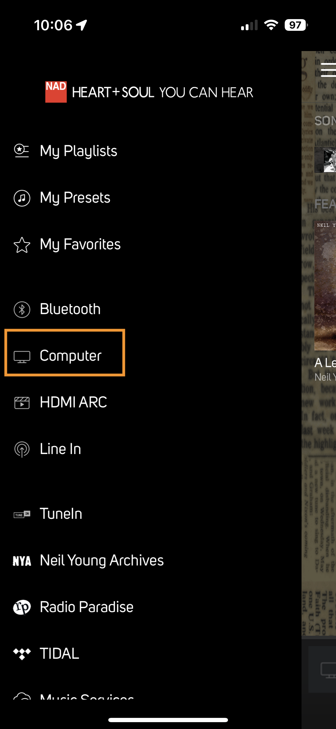
It means that in the BluOS app on the iPhone I selected "Computer" as the source to be used by the NAD M33 player which the BluOS app is controlling.
And correction. The rest of the display is not from Tidal, it is from NYA - Neil Young Archives. In any event, it is not the current source for the player.
 0
0 -
Mr. Evans - one of us is ill informed.
My comments are with respect to the BluOS app and its user interface. The developer of the BluOS app is listed as Bluesound. The BluOS website links to this forum.
Who do you believe designs and develops the BluOS app?
0 -
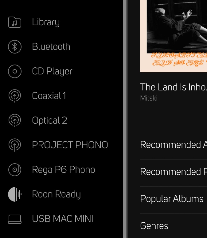
Hi Seppi. Russ or someone who set up his M33 has renamed one of the inputs "Computer" which confused me. I'm not sure what Russ is doing but NAD and/or Bluesound support should be able to sort him out. He is correct that his screen is somewhat incomprehensible – I've never seen anything like the mashup he's posted.
Here's a screen shot of my M33 inputs, some renamed by me.
 0
0 -
If you add a NAD MDC USB interface to the M33 enables hi-res streaming from a computer or NAS. It's not mysterious and shouldn't be confusing.
The hardware works fine, it's the UI and BluOS app displays that need help.
0 -
I have the USB MDC as well and named it something other than Computer so when I read your post I was confused as 'playing from computer' can be interpreted several ways. My display does not show the confusing UI yours does. That's why I recommend you contact NAD/Bluesound support directly.
All of this will be moot in 30 days as a 4.0 version of the app with a new UI will be released.
0 -
It all functions correctly, it's just a horrible UI. If that's about to change in 4.0, then I'll wait.
Thanks.
0
Please sign in to leave a comment.
Comments
15 comments