Feature requests and fixes
AnsweredHi there are a number of issues with the BluOS app for Windows
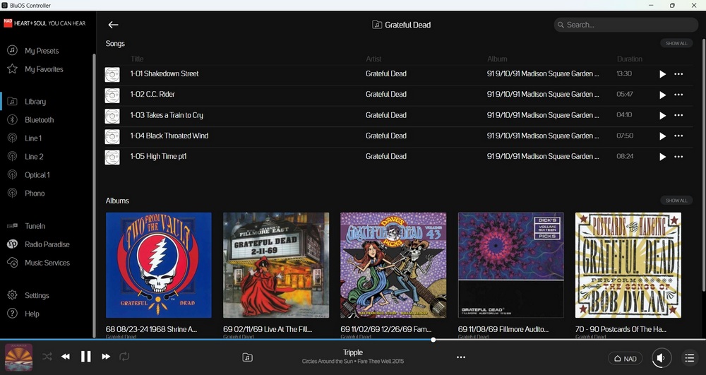
1: When going to an artist, why show the first 5 songs alphabetically and images of the first albums? This screen is useless. Get rid of that screen and go straight to the album art in alphabetical order.
Here is an example of an artist for which I have over 3400 songs and over 150 albums. It's a pointless screen.
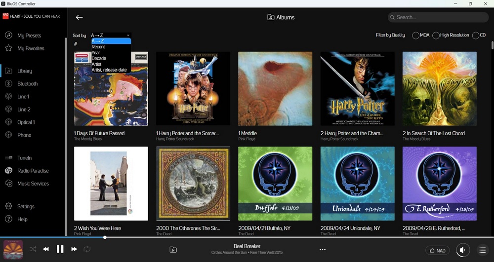
2: When going to Albums, allow a default setting. When one as 500 albums it's pointless to start the show alphabetically. You need to let a default set to Artist.
Not being able to set a default sort to artist is lazy.
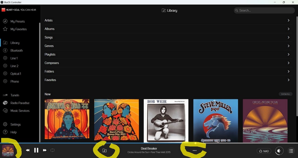
3: When playing an album but also browsing the music, there is no fast way to get back to the album view.
Pressing the three dots does nothing. The Folder icon does nothing. Clicking on the image of the album on the bottom right brings up the song but from there the three dots do nothing and don't being me to the album of the song I have playing. They used to but not any more.
-
Official comment
Hi John
Thanks for the feedback.
The preview screen of the most popular selections is a quick hit and is meant to ease the burden of larger bands with huge catalogues such as The Dead or The E Street band. Sorry to hear you don't like it.
The default setting of your album view is not being saved I have been able to reproduce it and have reported it to our QA team to investigate as it did in the past and is supposed to be remembered.
In the latest version of the App, I am having a hard time replicating toggling between the now playing/album view screen and the library browse screen. In Help, Aboutplease ensure you are on BluOS App 3.20.5. If you are and are still having the issue, please select Help, Send Support Request so our Support Crew may take a closer look.
-
Fully agree with these suggestions. The iOS app remembers the last-used sort order, so no idea why both the Windows/MacOS versions don't do this too. It's been mentioned more than once on these forums over the years, with the usual "we'll pass this on to the team" response, where the team appears to be /dev/nul
Here's a previous post on the matter: https://support1.bluesound.com/hc/en-us/community/posts/360051048014-Remember-Preferences
And like you said, that first screen when entering the artist albums is a complete waste of space, particularly the Songs section. Maximising the controller on a 32" monitor doesn't even show more than 5 albums - it just increases the cover art slightly and leaves a massive empty space in the bottom half of the screen.
I'm hoping the upcoming BluOS 4.0 update resolves these two issues, along with this long-standing one that displays incorrect information and has been driving me mad for over 2 years now, with apparently no interest by Bluesound to fix it: https://support1.bluesound.com/hc/en-us/community/posts/360052167233-Incorrect-Metadata-for-Year-Displayed?page=1#community_comment_9152564329879
0 -
Hello Tony
Thanks for the response though I really don't buy some of it.
"Hi John
Thanks for the feedback.
The preview screen of the most popular selections is a quick hit and is meant to ease the burden of larger bands with huge catalogues such as The Dead or The E Street band. Sorry to hear you don't like it."
I don't buy the above. Even when there is only one album, the 5 songs listed are in alphabetical order and is not scrollable. So the list of 5 songs is useless. It's not a "Quick hit". It doesn't hit anything unless an alphabetical list of 5 of perhaps 10 songs on an album is somehow useful. I don't know what use it would be. Imagine the only Pink Floyd album I have is The Wall. What use is an alphabetical list of the first 5 songs? Same if I only had Dark Side of the Moon. And the more albums I have the more useless the list becomes.
"The default setting of your album view is not being saved I have been able to reproduce it and have reported it to our QA team to investigate as it did in the past and is supposed to be remembered."
Thank you. Remembering the last order used would be a huge improvement. I hope they fix it.
"In the latest version of the App, I am having a hard time replicating toggling between the now playing/album view screen and the library browse screen. In Help, Aboutplease ensure you are on BluOS App 3.20.5. If you are and are still having the issue, please select Help, Send Support Request so our Support Crew may take a closer look."
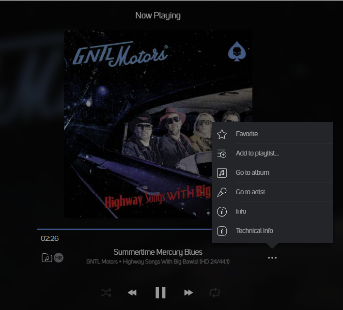
If there is an actual toggle, I'd like to know where it is. When I first installed the the BluOS Controller about 4 weeks ago, the three dots down by the currently playing song, pictured in the OP, would bring up a list of maybe 6-8 actions. One was to go back to that album. That no longer works. The dots are no longer clickable, just like the music folder icon.
These are the versions that I'm using. There are 2 different things being shown. The Windows App and BluOS. I certainly didn't downgrade one.

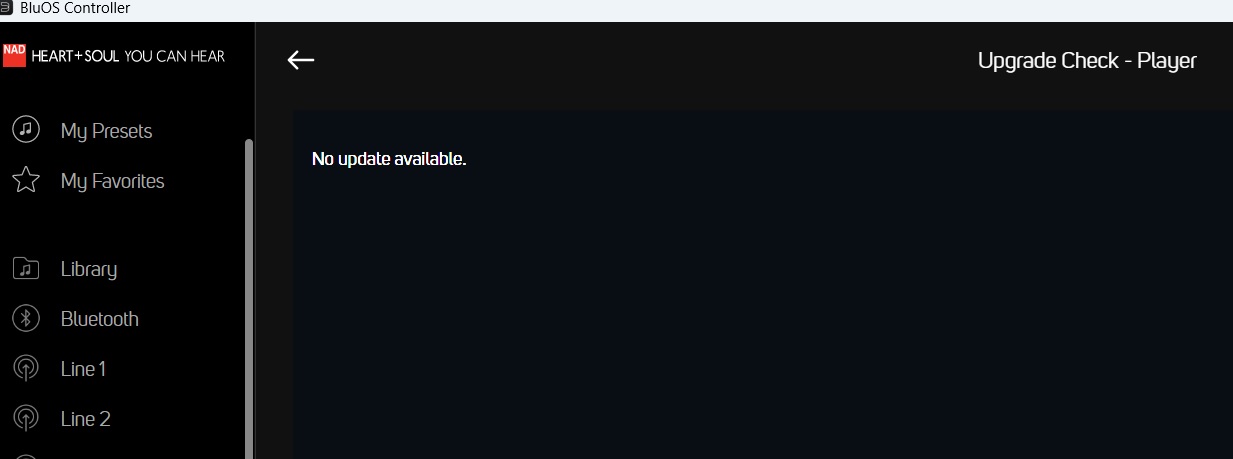
When I go to Help and check the for software updates, I get this. It says that the Controller is up to date.
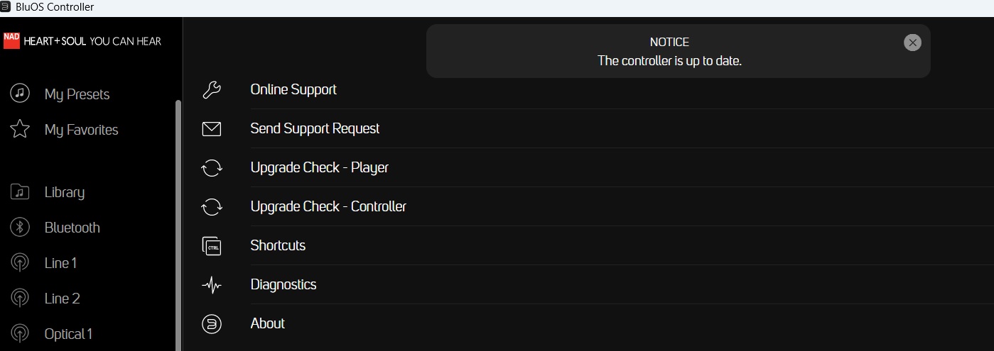
Just for the heck of it looking at update to the player which I presume is my NAD C 658, nothing is available.
 1
1 -
The toggle I am referring to is the album artwork in the lower left of the Now Playing tray. Our Support Crew will be happy to help with some of your more detailed 1:1 questions when you select Help, Send Support Request.
0 -
The album art of the song currently playing brings up the song but from there I still can't get to the album. There is nothing that's clickable.
I sent this thread to Support. I got a reply that has absolutely nothing to so with my question. They told me to move the NAD to a different location in the room.
0 -
Probably not very helpful, but mine works as expected.
 0
0 -
Mine used to do that. Now pressing the three dots does nothing.
0
Please sign in to leave a comment.

Comments
7 comments