No basic controls within the playlist
BeantwortetPersonal I do prefer to have a different layout of the screen within the android app. I prefer the windows style much more.
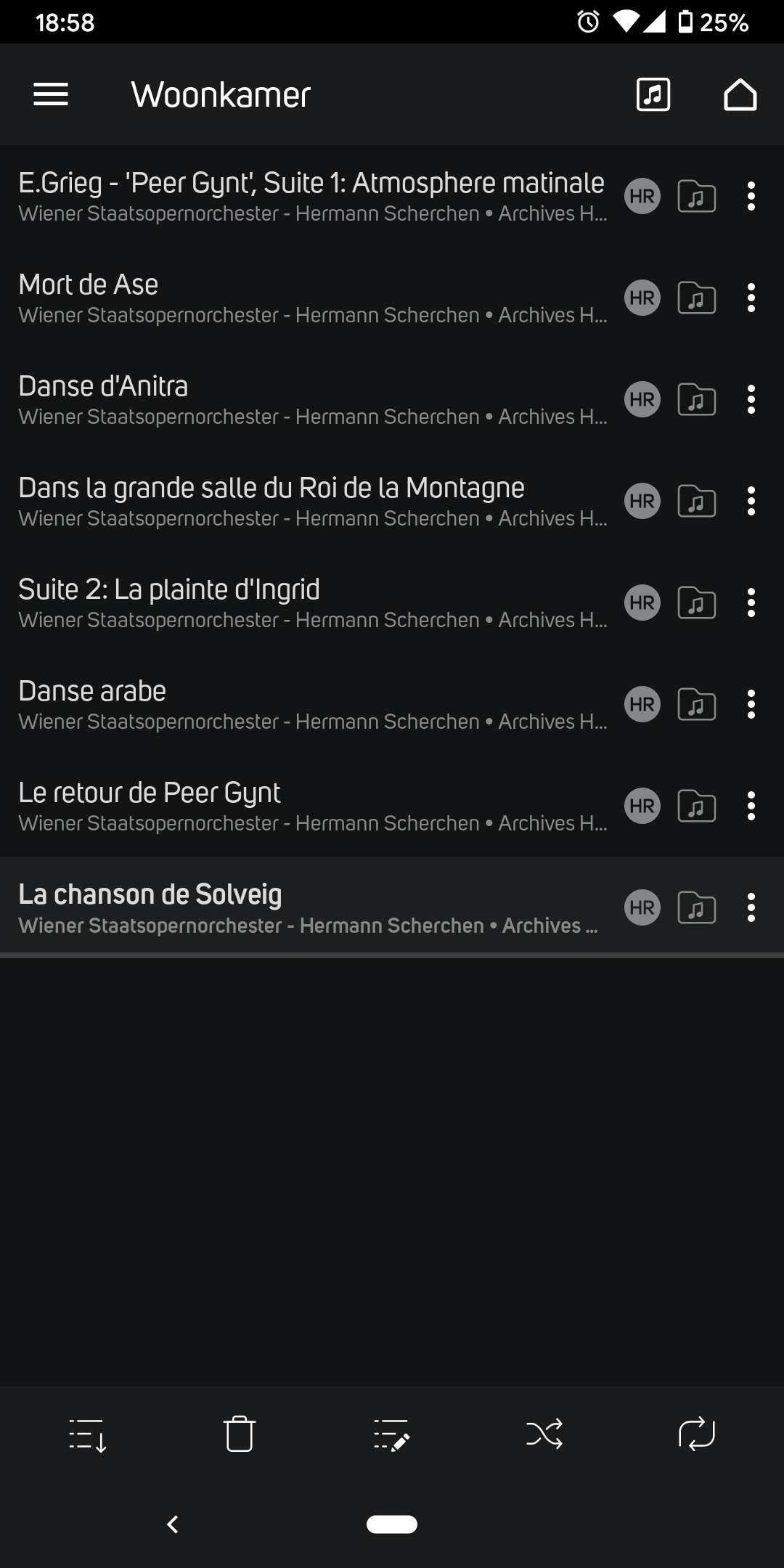
So when I go to the playlist within the andriod app, I do not see my now playing and my playing controls anymore. Because I like to see what is going on in the playlist for my current and next track, I "hate" the fact that there is no combination of this tools and information, just as on the windows application.
Could this be considered? Small previous, start/stop and next button with the current playing track info below the playlist screen within the andriod app
Looking forward to your news with interest.
Best regards,
Steven
-
Hello Steven,
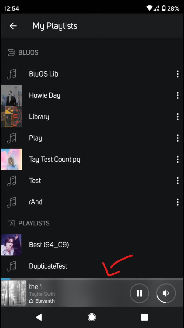
I may be misunderstanding, but when on the My Playlist screen there is the minimized Now Playing bar shown at the bottom:

Is this not what you have described?
Regards,
Sam R.0 -
Hi Sam,
That is not the exact location I mean.....

This screen I do miss the basic controls.
Regards,
Steven
0 -
Ah, thank you for clarifying. I will pass this on to our BluOS Dev Team for future consideration.
Regards,
Sam R.0
Bitte melden Sie sich an, um einen Kommentar zu hinterlassen.
Kommentare
3 Kommentare