Song repeats - how to turn them off in Windows & MacOS apps
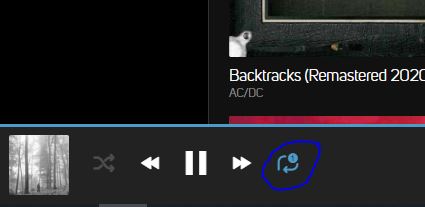
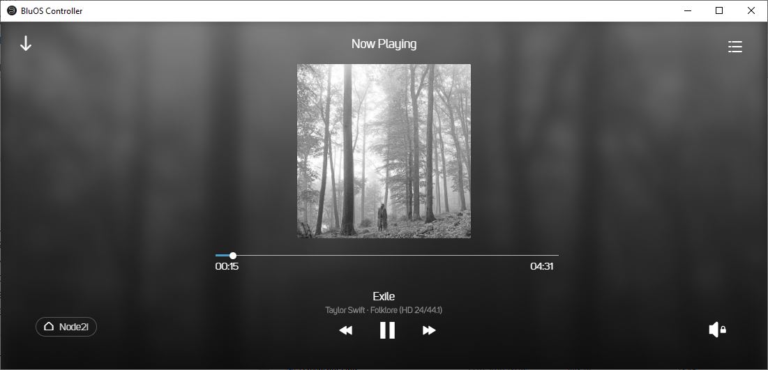
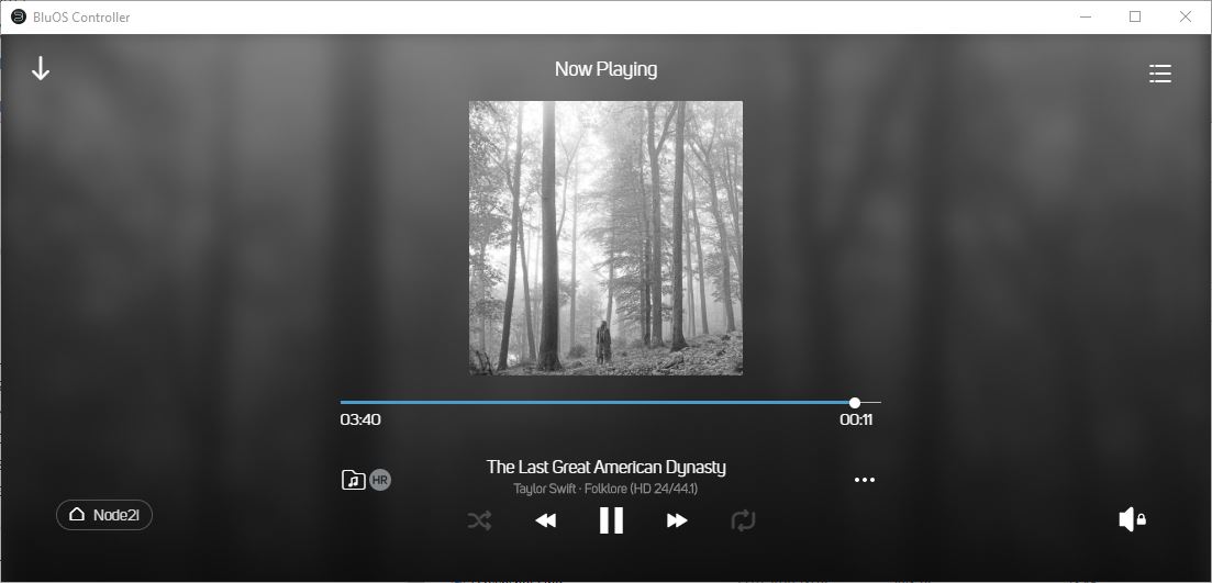
BeantwortetThere is either a bug or an unspecified restriction concerning repeats in the Windows & MacOS desktop apps. In the iOS & Android versions there is a button on the right hand side of the current play display which allows one to toggle the repeat setting. This does not exist in the most recent versions of the two desktop apps and there appears to be no way to control the repeat setting. I have my Node 2i set up with a fixed volume output and there is an icon of a speaker with a lock to indicate no volume control but nothing else on the right hand side.
I don't care that much about controlling repeats for individual songs or playlists. It would be even better to be able turn off repeats permanently. At the moment the only way to stop them is to bin the playlist which is absurd if you want to run the desktop app in the background. Since the documentation is so poor it is practically impossible to find out what options may be buried somewhere in the app.
-
Try the other "right hand side" (left or middle)
 0
0 -
That icon/button does not show up on either of the Windows or MacOS apps that I have installed.
I am using Windows/MacOS versions 3.8.3 with BluOS 3.8.17 on my Node 2i.
0 -
That's weird, but it "could" be related to your screen resolution. Those buttons will be truncated/invisible if the resolution isn't wide "enough". (abt. 1100 px).

 0
0 -
My Windows screen resolution is 1920 x 1080 with a landscape (wide screen) display and my iMac resolution is similar. Bluesound have a serious problem of compatibility with either operating system if they are unable to show icons at this resolution. The whole point is that icons of this kind are supposed to scale to match the screen resolution.
0 -
Hello Gordon,
Its very odd that the repeat button does not show in both versions of the BluOS app. I imagine you have already maximized the window? If uninstalling/reinstalling the app does not fix this, please send our support crew a support request via the BluOS app's Help > Send Support Request so they may look at this further.
In the meantime, you can use the shortcut CTRL+R in the BluOS app when you have music in the queue to toggle the repeat functionality. Since you're doing it without seeing the button change, the order is No Repeat > Repeat At End > Repeat This Song.
PS Bjørn, you have excellent musical taste.
Regards,
Sam R.0 -
OK, now I understand what is going on.
I misunderstood Bjorn's comment as referring to the screen resolution but it is the window size that matters. Yes, if I increase the horizontal window size sufficiently the shuffle & repeat icons appear (along with other icons). The threshold for window width is about 1125 px for the icons to show up. This is a bizarre programming quirk - I assume that the icons have minimum pixel requirements which don't scale properly with window size. I thought that any interface designer today would be conscious of this problem, if only because of the need to deal with a multiplicity of phone screen sizes & resolutions. I would suggest that you add this to your FAQs.
On the related issue of interface design, why don't you provide a light mode option? The dark mode design is horrible.
0
Bitte melden Sie sich an, um einen Kommentar zu hinterlassen.
Kommentare
6 Kommentare