Bug: no indication of playing album track

This concerns a bug born end May 2024 with the introduction of the Android controller app 4.4.0 and reported to Bluesound on 13 June 2024. Response at the time was:
"Following discussions with our Engineering team regarding your specific issue, they have replicated the issue in our labs. Our Engineering team will conduct further investigation and provide a fix for this issue in an upcoming firmware update.
Unfortunately, we in technical support do not receive timelines for future development and releases, so I cannot provide a definite date for when this update will be available. Nevertheless, please be assured that our Engineering team is diligently working to resolve this issue as promptly as possible."
Eight months and seven app updates later nothing has been resolved at all. The bug comprises following two issues, see also the screenshots below.
- On the playing album track listing the android app does not show the blue progress bar any more underneath the currently playing track. There is no indication whatsoever which of the tracks is playing.
- The distinction between a work and its movements is not shown anymore. Previously the movements were indented and in a thinner font.
Item 1
Every decent music app has some indication of which track is playing, some examples
- Spotify, playing track highlighted green, other tracks white
- Qobuz, dancing spectrum in front of playing track, other tracks show track number
- Idagio, pause button in front of playing track, other tracks show play button
- Presto, same as Idagio
- BluOS v 4.2.4, grey bar underneath playing track, filling up blue as the track progresses, being one of the nicest implementations
- BluOS v 4.4.0 onwards, no indication whatsoever
While this may not be too bad for a pop album, it is horrendous for classical music, where album track lists are elaborate and long, commonly spanning multiple phone screens. It affects Idagio, Presto and Qobuz and probably all other online streaming services that utilise the BluOS app interface.
IMO this issue alone qualifies the Android BluOS apps 4.4.0 onward as unsuitable for classical music. Unsurprisingly, I am still using 4.2.4, as this seems to be the only workaround.
Item 2
While not as bad as item 1, it is an unnecessary regression, reducing the readability and quality of the BluOS user experience, especially for classical music. Due to the thicker font used for the movements, it makes the track listings even longer.
Screenshots
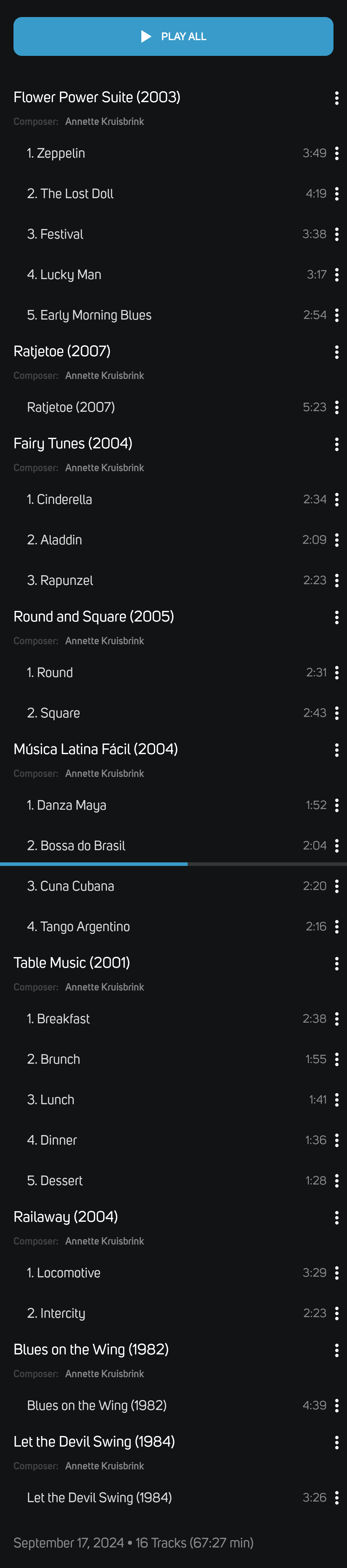
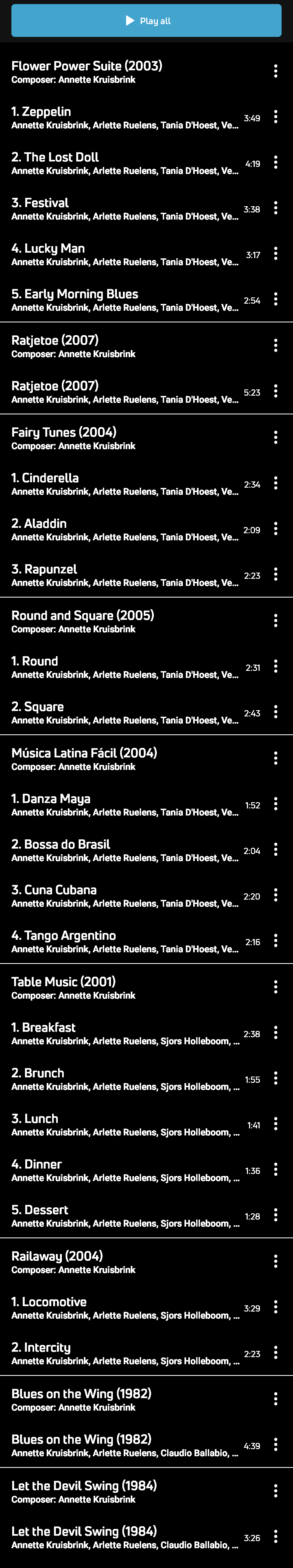
As an example, I have taken the 67 minute CD Ensemble: Music for 4 and 6 Guitars Composed by Annette Kruisbrink on Idagio. The track listings run from the Play all button to the last track Let the devil swing, while Bossa do Brasil halfway the listing is playing.
Affected:
- Android BluOS controller app 4.4.0 onward (at time of writing 4.4.0 through 4.8.0)
- BluOS 4.4.11 onward (at time of writing 4.4.11 through 4.8.17)
- Idagio, Presto, Qubuz and likely others
Not affected:
- Android app 4.2.3, 4.2.4
Special notes (meant for the BluOS team)
- The apk of app v 4.2.4 was 16.78 MB, v 4.4.0 was 14.80 MB. Apparently a lot of code was removed for the 4.4.0 update, maybe too much?
- This bug affects how the track listing is displayed on the Android screen. Most likely this depends solely on the Android apps, not on BluOS.
- You have the code laying around that works properly, i.e. the code of app v 4.2.4.
- Please fix these bugs, as you promised eight months ago in your response as quoted above.
Displayed on controller app v 4.2.4:
Displayed on controller app v 4.8.0, note the thin lines are barely visible on Android:
-
Offizieller Kommentar

Hi Pinot
Thanks for the feedback - I have passed it on to our Quality Assurance Team - some quick feedback however...In Idagio,Works are displayed on the Album's Playlist details Page;
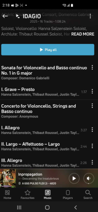
Note that in the Play Queue of the Now Playing Screen there is a three-bar level indicator that will 'dance' on the currently playing track.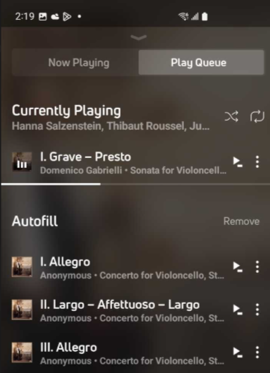
-
Hi Tony,
You are not telling me anything new.
I did not state the Works are not displayed, I stated they are displayed exactly the same way as the movements, zero distinction between the two. Display on 4.2.4 is fantastic, on 4.4.0 through 4.8.0 is simply awful.
The play queue is a workaround that requires additional action to get to it and more action to get back to now playing and the album's tracklist. This is not a solution to the issue. Display of playing track in the album's track listing is a very basic feature present in every decent music app including 4.2.4. It has been absent since 4.4.0 and some cumbersome workaround is no decent solution.
0 -
As an additional note: if I would not have the 4.2.4 option, my work around would not be what you have suggested for 4.8.0. It would be fallback to an old Chromecast Audio connected by FOC to my pre-amp and using the native Idagio app. That €25 setup has currently a far better UX than a €600 Node setup under 4.8.0.
We users have clearly very little influence on bug fixing, as this has been reported 8 months ago and promises to resolve it have not been met to date. It is up to the management of Lenbrook / BluOS / NAD / Bluesound how low you wish to set the bar for yourselves.
0 -

I can't understand why the presence of the progress bar isn't part of the standard regression test pack for all new controller app versions. It's such a fundamental thing to check for, and it's just a one line test with one expected result in a script.
I also can't understand what would drive the decision to use a coarse font with no indents for the display of classical works that are made up of several movements when, very clearly, someone at Bluesound previously knew all about just how important it was to display classical works in the way that they previously were.
Are we looking at a great loss of knowledge within the UX design team about how to display classical music recordings, or are we looking at a prideful disregard of something that others know to be essential, or are we simply looking at a bug?
I just can't see anyone deliberately setting out to make something less useful.
0 -
Ian, nice to see someone else who appreciates classical music and its specific demands regarding UX.
One would expect BluOS (including sisters NAD and Bluesound), Idagio and Presto to have a mutual interest to provide a good UX for the classical music afficionados, especially after competition Apple launching Apple Classical based on Primephonic.
0 -
@Bluesound:
Ten days ago my Idagio subscription lapsed and currently I shall not renew it, while this bug is alive. If it not will be fixed, I shall have to start looking for alternatives.
Is there any intention to actually fix this? If so, can you indicate when we can expect such, it has been around for a year now?
0
Bitte melden Sie sich an, um einen Kommentar zu hinterlassen.
Kommentare
6 Kommentare