New version of bluesound app and volume bar length
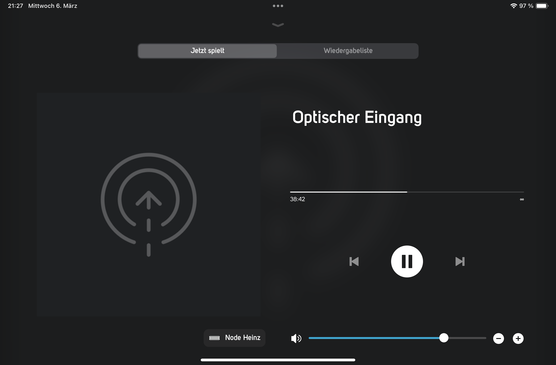
I downloaded the new version of the bluesound app a few minutes ago, on the iPad and iPhone. Everything is fine. Only one thing I don't like at all. The volume bar has shrunk to half of the way...without need. Why is that? It is no longer so finely adjustable. Sometimes fashionable design is a step backwards. I would be very happy if the full width of the screen could be used for the volume bar again.

-
I haven't noticed this on my iPad but, if this is the case, is it part of the current trend of changing the user interface on lots of apps to better suit mobile phones at the expense of throwing away the benefits associated with handheld devices with larger screens such as iPads?
0 -
I see it now.
My iPad controller app seems to have updated itself overnight without my permission (!!!!!!), and I also now have the small volume slider.
I'm now almost, but only almost, in two minds inasmuch as splitting the volume and pause-playback functions across two displays with a toggle feature as Bluesound did a few years back was a thorn in my side for years. This is partly because it was an annoying retrograde step, and partly because toggling between the two displays was what seemed to trigger the famous "moving volume slider" bug.
Having said that, however, before the display was originally split, everything was displayed at once but the volume slider was much wider.
For me, the current issue is the amount if space used on the left hand side to display the album sleeve and track details. This is what is causing the volume slider to be small. Is this really needed, however, when the play queue is also displayed? (Hint, hint.)
There is, however, a better sharing out of space in landscape so, in the interests of not having the annoying toggle feature, I'll cope manfully with this while Bluesound refine what is, in essence, a long overdue improvement to the User Interface.
0 -
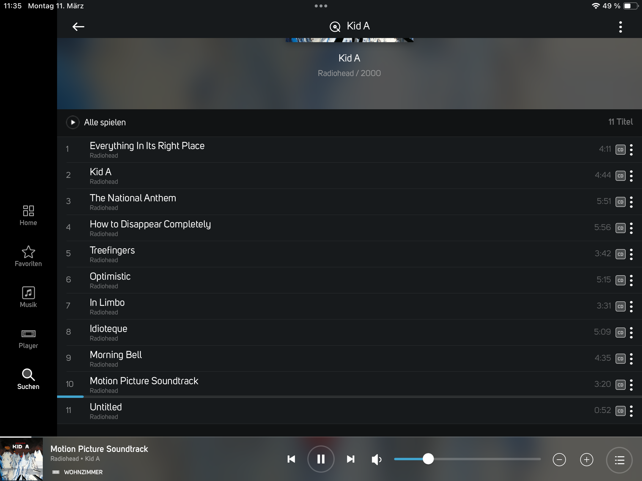
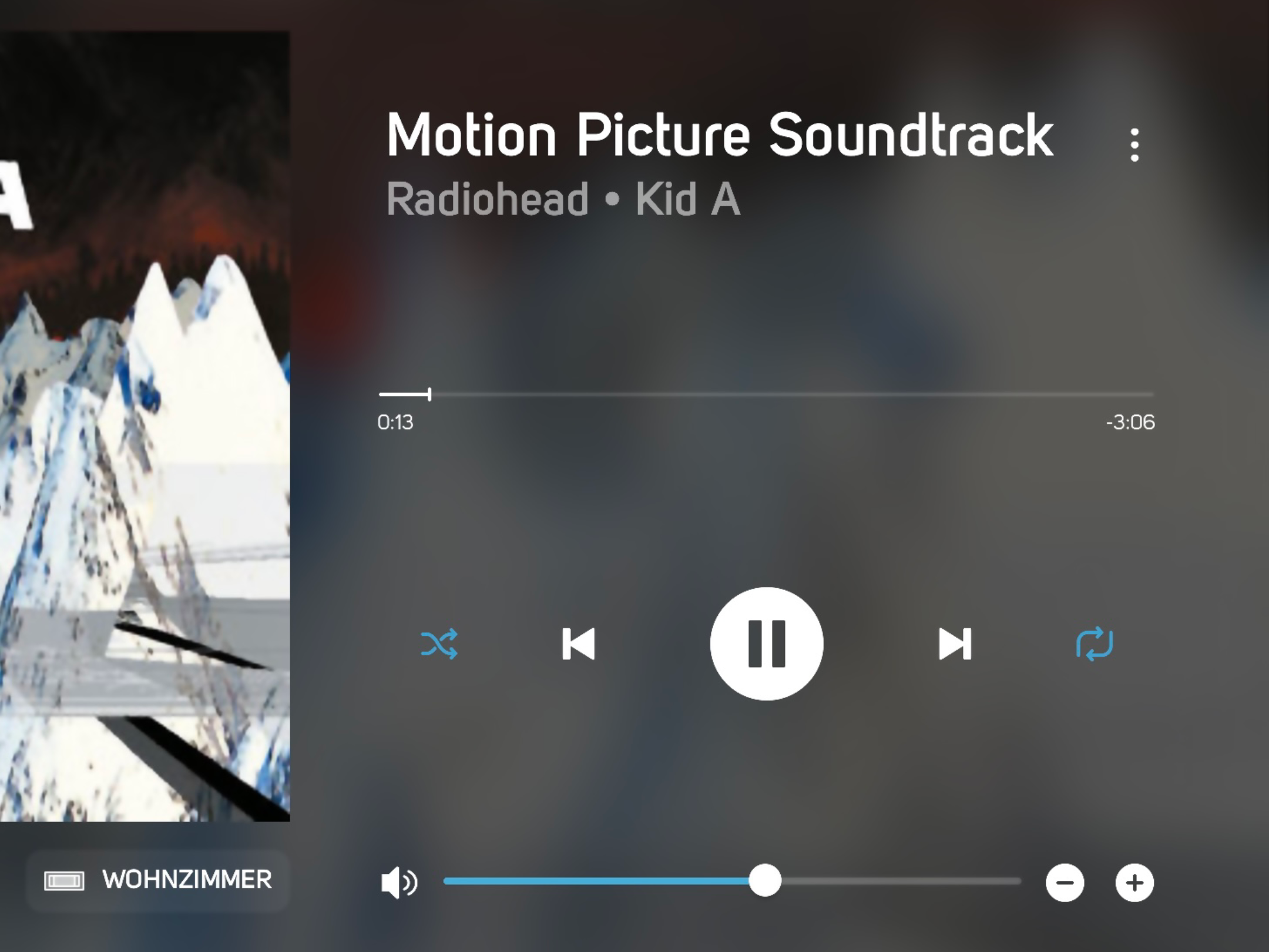
 There is another issue with the new version. When changing the viewscreen from album-view to title view, the volume slider goes in the middle position. So when I adjust the volume in the title-view the volume first drops or increase to the middle position. Before Bluos4.0 this was already an issue, solved with 4.0. Now it appears again? Why?1
 -
And here the title view:
 1
1 -
In reality the two volume settings are not synchronized. The slider on the title-view doesn’t follow the slider of the album view or vice versa…
1 -
No reaction about this issue known since long time. Come on…
1
Bitte melden Sie sich an, um einen Kommentar zu hinterlassen.

Kommentare
6 Kommentare