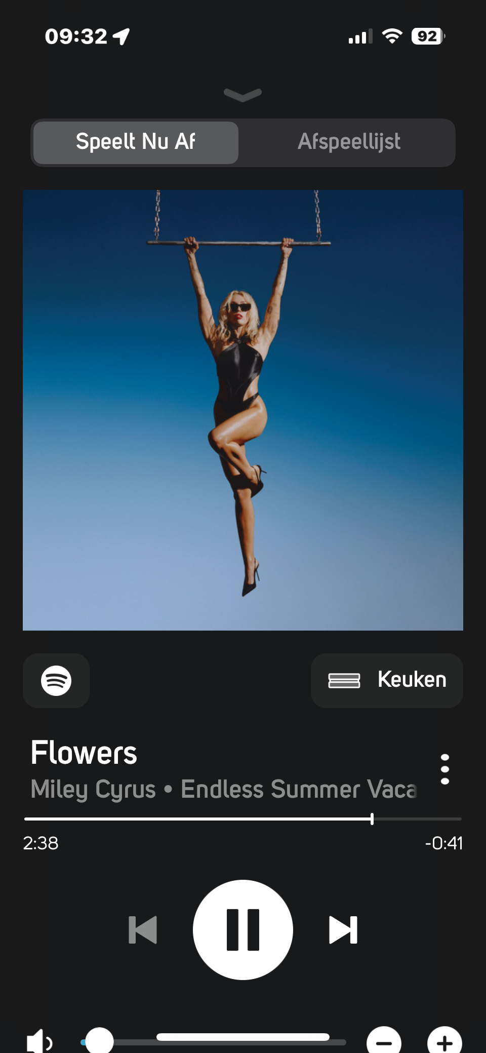
Volume control on iPhone
Beantwortet-
Offizieller Kommentar
Hi Douglas,
As a temporary workaround, you can fix this by temporarily disabling or turning off "Larger Text" settings on your iPhone. This can be found in iPhone settings >> Accessibility >>Display & Text Size.
Hope this helps.
Thanks for #LivingHiFi -
I have the same problem. As a visually impaired person, it is unfeasible to turn off larger text. It must also be noted that with the latest iphone models, the rounded edges of the bottom of the screen seriously hamper using the volume buttons: the + sign is too small. You cannot use the volume slider, as it will slide the whole app away. This is because of the horizontal bar overlapping the slider on the bottom of the screen, I mean the horizontal bar which you normally use to switch apps or navigate to the home screen. Using the hardware volume buttons isn't an option either, as the volume increase/decrease is too much. From too quiet to too loud with one press of a button. That's the number one reason that I must use the volume control buttons in the app.
In the previous controller app, the volume buttons were perfectly useable with "larger text" set in the accessibility options.
The better UX design choice would be to scale down the album art. In this case I prefer readable text and useably buttons over graphical elements.
I love my bluesound stuff; I would be grateful if you could resolve this UX issue.
 0
0 -
Thanks for your patience Chris. This one is a little trickier than anticipated in conversations with our Development Team but we are working on it. Thanks for your patience and we do apologise for the inconvenience...
0
Bitte melden Sie sich an, um einen Kommentar zu hinterlassen.


Kommentare
3 Kommentare