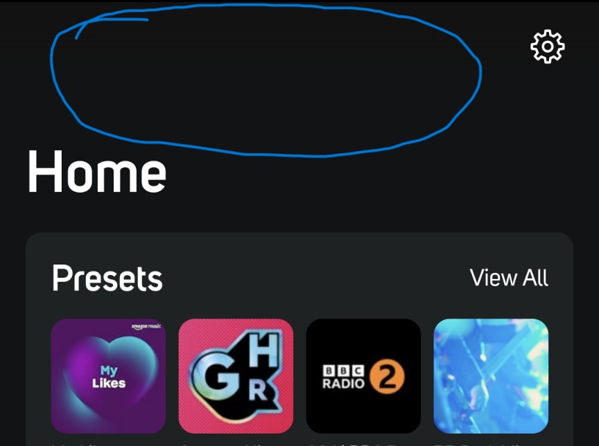
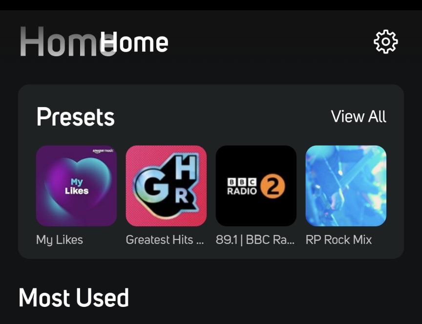
Wasted real estate at top of the Android app
I'm pretty happy with the way that the Android app for BlueOS 4x has progressed over the last couple of releases. Some improvement request have been covered elsewhere, but one thing I'd like to request that I have not seen mentioned, is an improvement to the wasted "real estate" at the top of the Home screen.
There is a fairly large blank space between the top of the screen and the word "Home".
I realise there may still be more pressing issues to consider, but would it be possible to adjust that in a future release so that the word "Home" appears at the top of the screen level with the settings button?

It would improve the amount of information available on the home screen without having to keep scrolling down to access more than the first two item rows configured on the screen.
-
Offizieller Kommentar
@Phil, thanks for posting this feedback. We'll take a look with the design team as we chip away at improvements.
-
Thanks Matt. One thought that occurred to me after I posted was that there was originally a message about the option to revert to the old style interface in that location, which I had dismissed on an earlier v4 app version. I noticed that the option itself is still present in the app menu however, although intended to be removed eventually, so I wonder if the empty space on the Home screen will disappear when that happens?
0 -
That could be it...still, I think the app should be dynamically responding to you dismissing that message. Should all get sorted as we move forward!
0
Bitte melden Sie sich an, um einen Kommentar zu hinterlassen.

Kommentare
3 Kommentare