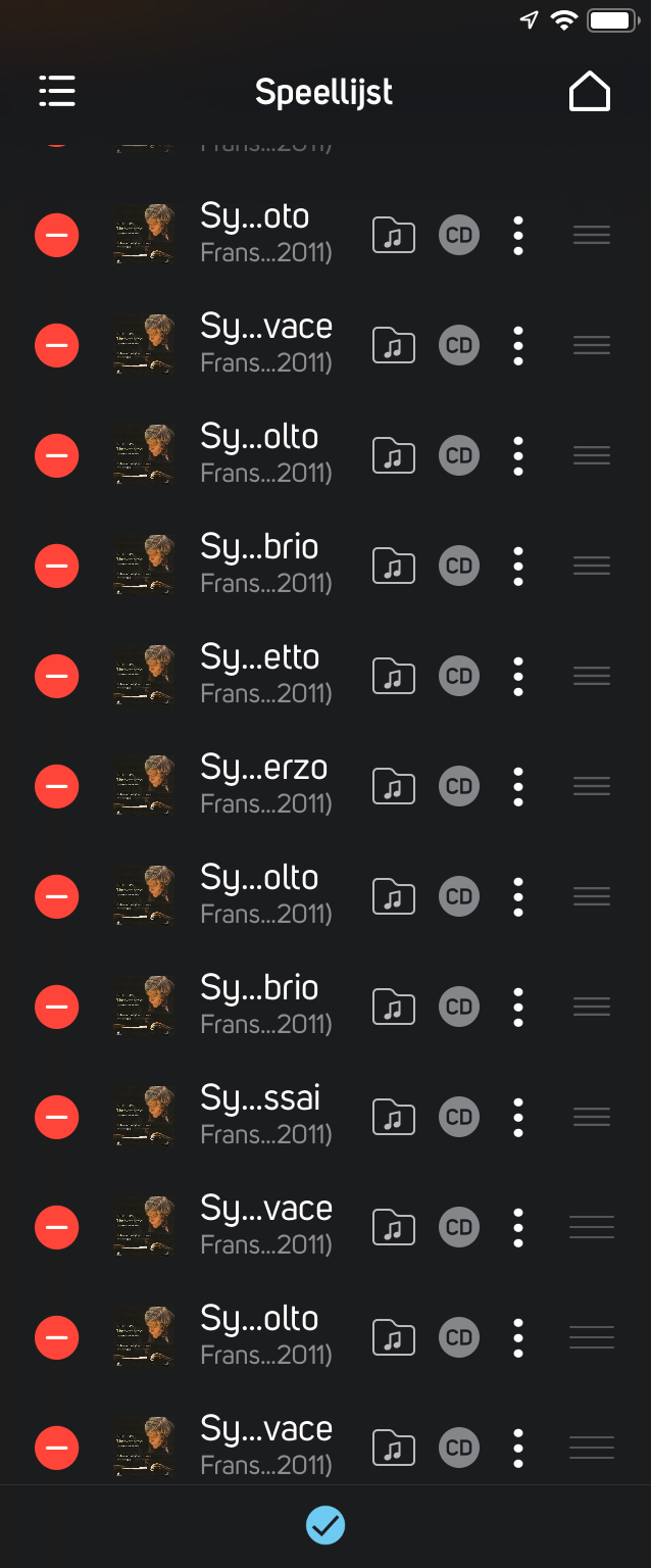
Increase width of the playlist column
Sorry if this question is asked before, I’m new to Bluesound and could not find an anwer to my question. How can I make the column size of the playlist a bit wider? Especially in edit mode, I can barely read the song titles as only 6 letters are shown with some dots in between
-
Oh, so there used to be a “play next”? Not killing, but indeed that is a nice feature!
Back to the playlist: with classical music, the playlist is just useless. See here a random classical album: 0
0 -
I like the Bluesound node a lot, and appreciate the focus on the local library (hidden somewhere in Sonos), but the playlist implementation is just an insult for people who listen to more than pop or rock music
0 -
Solved in BluOS4. Thanks!
1
Bitte melden Sie sich an, um einen Kommentar zu hinterlassen.
Kommentare
3 Kommentare